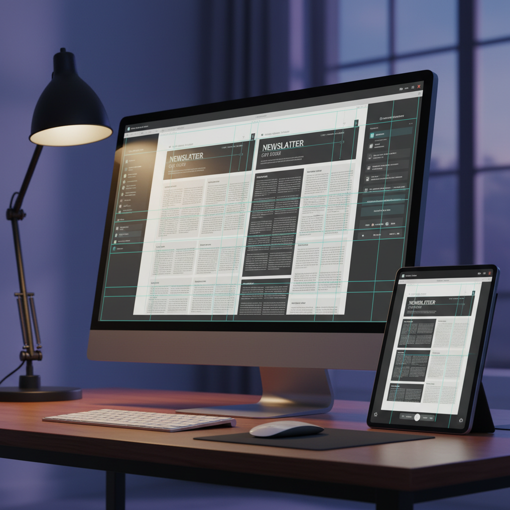
A cinematic, photographic scene of a large widescreen monitor on a clean, dark wood desk displaying a complex grid system for a multi-column newsletter, with baseline grid and margin guides clearly visible in soft cyan. Next to it, a tablet shows the same layout adapted for digital viewing, demonstrating responsive desktop publishing. Both screens feature neutral gray interface chrome and restrained use of color in the designs. A single adjustable desk lamp with a matte black finish casts focused, warm light on the desk surface, while cool ambient light from the background keeps the room softly lit. The contrast of warm and cool lighting adds depth, with subtle reflections on the screens. Composed using the rule of thirds at a three-quarter angle, the scene feels modern, strategic, and highly professional.

Smart Desktop Publishing

I blend editor and design skills to craft readable, usable desk layouts that help your message connect clearly with every reader.
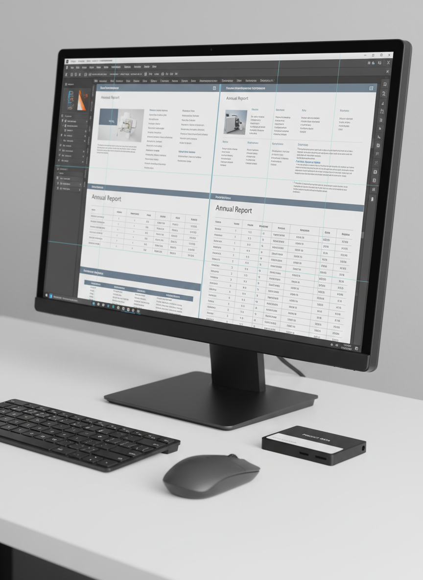
A close-up, photographic view of a desktop monitor displaying a sophisticated multi-page annual report layout in InDesign, with a neutral color palette of slate gray, soft white, and muted blue accents. The screen shows precise typographic hierarchy, master page grids, and aligned tables. Around the monitor, only a slim wireless keyboard, a matching mouse, and a single neatly labeled external drive sit on a matte white desk, leaving generous negative space. Soft studio lighting from the left creates subtle reflections on the monitor’s glass and delicate shadows beneath the peripherals. Captured from a slightly elevated three-quarter angle with shallow depth of field, the focus rests on the meticulous alignment and structure on-screen. The atmosphere feels precise, methodical, and corporate, highlighting professionalism and smart, readable design.
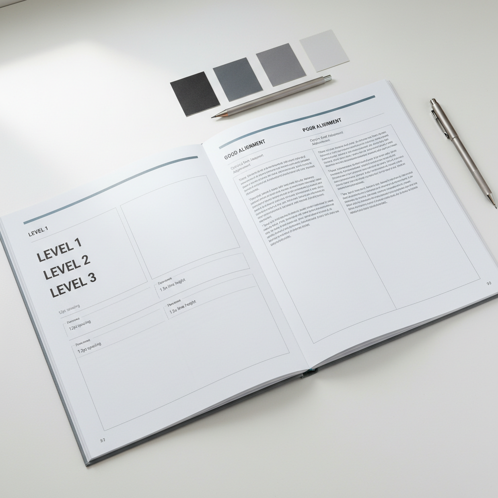
A highly detailed close-up of a style guide booklet for a corporate report, opened flat on a pristine white desk. The pages show clearly defined heading levels, paragraph spacing, grid specifications, and examples of good versus poor alignment, all in a subtle grayscale palette with one muted accent color. Ultra-thin lines delineate margin and column systems, and small annotations explain typographic choices. Nearby, precisely arranged gray swatch cards and a minimalist mechanical pencil sit parallel to the booklet’s spine. Soft, diffused daylight from above and slightly to the left creates minimal shadows and emphasizes the paper’s smooth texture. Captured from directly above with sharp focus throughout, the composition feels highly ordered, instructional, and authoritative, underscoring the site’s emphasis on smart, readable, and usable design rooted in professional desktop publishing practice.
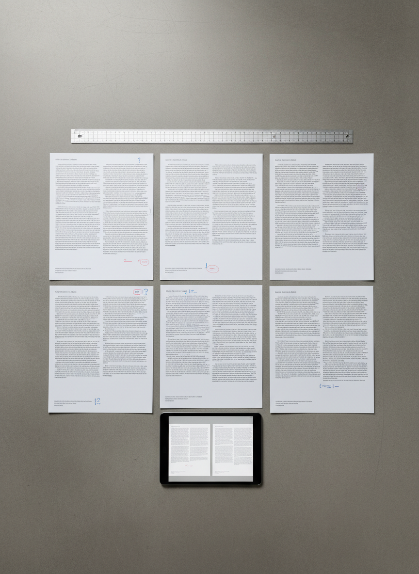
An overhead, bird’s-eye view of a design and editing review session represented only by objects: a spread of printed brochure pages with carefully aligned columns, balanced margins, and consistent typographic styles laid out on a smooth concrete tabletop. Red and blue pencil marks indicate light corrections and thoughtful editorial notes, but the pages remain tidy and uncluttered. A silver metal grid ruler and a slim, dark gray tablet displaying the digital version of the layout sit parallel to the page edges, reinforcing structure. Neutral, diffused overhead lighting creates soft, even illumination with almost no harsh shadows, emphasizing the flatness and clarity of the layout. The composition follows strict right angles and clean lines, conveying a meticulous, professional mood and a minimalist, corporate photographic aesthetic.